
Hit 8.5%? 2026 Landing Page Conversion Rate Benchmarks for Marketers
A landing page conversion rate above the median across industries puts you ahead of average performance, and rates in the top range put you in top-quartile territory for most page types. Before you celebrate or panic over your number, check one thing first: is your conversion rate segmented by traffic source and page type? A blended average hides more than it reveals.
TL;DR:
- Conversion rates vary significantly by industry and traffic source, with home services averaging around 8.5% and B2B around 2.6%.
- Segmenting data by traffic type, device, and page purpose is essential to accurately assess performance and identify real improvement opportunities.
- Fixing message mismatch and reducing form fields typically produce the largest and quickest increases in conversion rates.
- Prioritize low-effort, high-impact tests like headline and call-to-action changes before considering full redesigns or aesthetic tweaks.
- Seasonality, campaign changes, and visitor intent heavily influence conversion rates, making context-specific benchmarks crucial for realistic goal-setting.
Table of Contents
- What is landing page conversion rate and how do you measure it?
- How do landing page conversion rates compare by industry and traffic source?
- What factors actually drive landing page conversion rates?
- How should you prioritize A/B tests for the biggest impact?
- Quick wins to raise your conversion rate this quarter
- How do you set realistic conversion rate targets?
- How agencies operationalize this checklist for trade businesses
- Does visitor intent change what a good conversion rate looks like?
- How do seasonality and campaigns affect your numbers?
- How do you combine qualitative feedback with your conversion numbers?
- What the 2026 benchmarks actually tell marketers to prioritize
- Get a fast-start audit for your landing pages
- Sources
- FAQ
What is landing page conversion rate and how do you measure it?
Landing page conversion rate is the percentage of visitors who complete your intended action, divided by unique visitors, times 100. If 2,400 people land on your quote-request page and 156 submit the form, you’re at 6.5%. Simple math, but the calculation only means something when you measure it the right way.
The biggest mistake marketers make is comparing apples to oranges. A demo-request page for enterprise software should never be judged against a free content download, and organic traffic behaves nothing like paid search traffic. Campaign Monitor’s guidance on conversion measurement stresses linking each campaign to its own dedicated landing page, precisely so the numbers stay clean and attributable.
Before you trust any conversion figure, run through this quick verification:
- Segment by traffic source. Paid search, organic, email, and paid social visitors convert at different rates because they arrive with different intent levels.
- Segment by page type. A pricing page, a free-trial signup, and a gated ebook download are three different jobs with three different benchmarks.
- Check for duplicate events. Analytics platforms often double-fire conversion pixels on page refresh or back-button navigation, inflating your rate artificially.
- Confirm your attribution window. A seven-day click window tells a different story than a 30-day one, especially for longer B2B sales cycles.
- Split mobile from desktop. Blending them together masks a gap that usually matters more than any headline tweak you’re about to make.
Get this measurement layer right before you touch a single benchmark table, because a wrong denominator makes every comparison after it worthless.
How do landing page conversion rates compare by industry and traffic source?
Benchmarks only help when you’re reading the right one for your business. Unbounce’s analysis of 41,000 landing pages found a median conversion rate of 6.6% across industries, but that figure flattens enormous variation once you break it out by sector and page type.
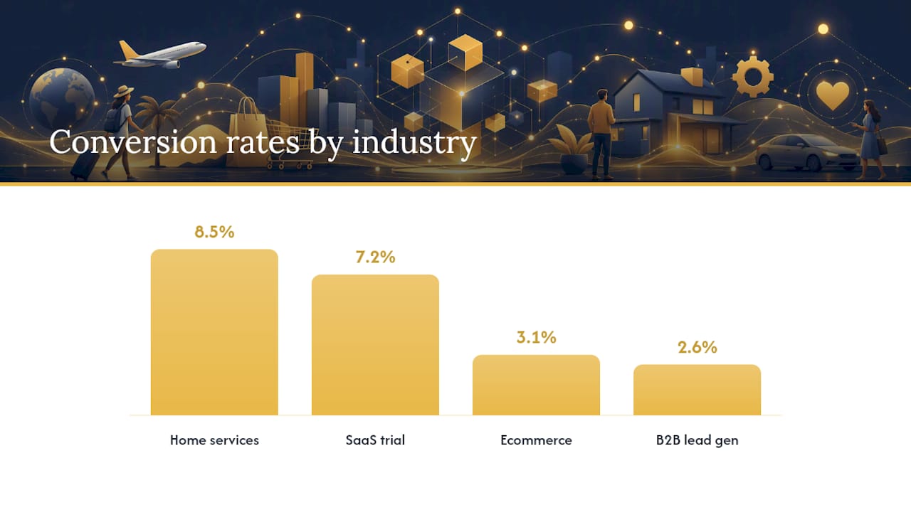
CorePPC’s 2026 industry benchmarks show home services pages converting at a median of roughly 8.5%, well above ecommerce’s 3.1% median and closer to SaaS free-trial pages at around 7.2%. That gap makes sense once you think about intent: someone requesting a furnace repair quote is closer to a buying decision than someone browsing a product catalogue.
| Industry / page type | Median conversion rate | Top quartile / decile |
|---|---|---|
| Home services (quote/booking) | ~8.5% | Top performers push into the mid-teens |
| SaaS free trial | ~7.2% | Top quartile reaches double digits |
| B2B lead generation | ~2.6% | Top quartile ~7.2%, top decile 12%+ |
| Ecommerce | ~3.1% | Varies by cart value and category |
Dupple’s B2B benchmarking data puts average B2B landing page performance at roughly 2.6%, with the top quartile hitting 7.2% and the top decile clearing 12%. That’s a wide spread for one category, and it tells you something important: the difference between an average B2B page and an elite one isn’t a single trick, it’s a stack of smaller fixes applied consistently.
Traffic source matters just as much as industry. A few patterns show up repeatedly across CRO reporting:
- Paid search traffic tends to convert higher than average because visitors clicked an ad with clear commercial intent, but only when the landing page message actually matches the ad copy.
- Organic traffic often converts lower on transactional pages but higher on informational content offers, since visitors arrived through research rather than a direct call to action.
- Email traffic usually shows the strongest conversion rates of any source, because the audience already opted in and knows your brand.
- Paid social traffic frequently lags the others, since social platforms interrupt rather than respond to active intent.
Device also splits the numbers hard. CorePPC’s data shows desktop consistently outperforming mobile across most industries, sometimes by several percentage points on the same page. That gap isn’t really about screen size. It’s about form friction, load speed, and layout decisions that punish mobile visitors disproportionately, which is exactly why mobile optimisation deserves its own line item in any testing plan rather than an afterthought.
Picking the right benchmark comes down to answering three questions honestly: what page type is this, what traffic is driving it, and what device split are you actually seeing? Match your number against the closest category, not the blended industry average, and you’ll get a far more useful read on whether you’re underperforming or already ahead of the pack.
What factors actually drive landing page conversion rates?
Four levers explain most of the variance between an average landing page and a top-quartile one: message match, form friction, page speed, and social proof placement.
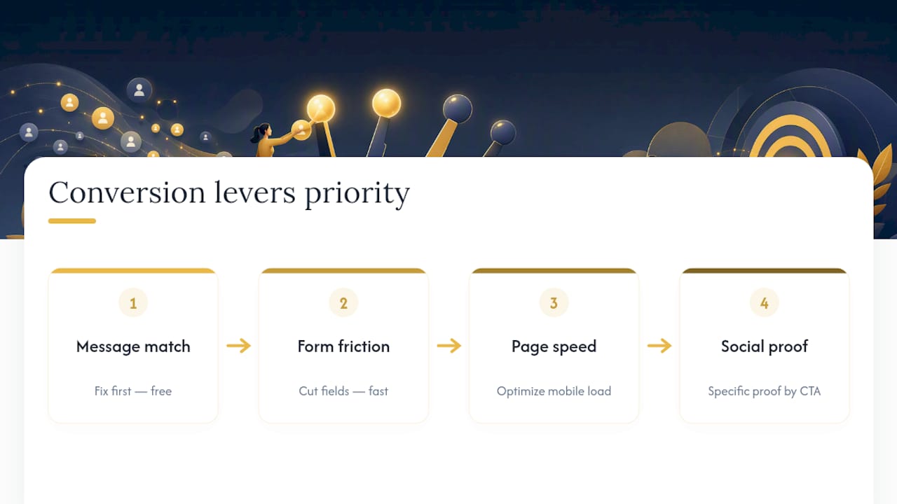
Message match is the fastest win most teams skip. If your ad promises “same-day furnace repair” and the landing page headline talks about “comprehensive HVAC solutions,” visitors bounce because the page didn’t confirm what they clicked for. A quick test: read your ad and your headline back to back. If they don’t sound like the same promise, you’ve found your first fix.
Form friction costs more than most marketers assume. Every additional field on a form reduces completion rates, and B2B teams that cut forms down to three or four essential fields, then use progressive profiling to collect the rest later, consistently see major uplifts in form completion without sacrificing lead quality, as long as a fast automated qualification step follows.
Page speed punishes harder on mobile than most teams realize. A one-second delay in load time compounds with every other friction point on the page, and since mobile traffic often arrives on slower connections, speed problems that seem minor on desktop become conversion killers on a phone.
Social proof works best when it’s specific and close to the action. A generic “trusted by thousands” banner does far less than a named client logo or a real number placed right next to your call-to-action button.
These four factors rarely act alone. Hyperspect’s pattern analysis of top-performing B2B pages found that elite conversion rates come from compounding fixes rather than one dramatic change, including cases where reducing form fields alone drove completion gains north of 120%.
Pro Tip: Run your message-match test before touching anything else on the page. If the headline doesn’t survive a side-by-side read against the ad, every other fix you make is patching a leak upstream of the real problem.
Prioritise in this order: fix message match first since it’s free, cut form fields second since it’s fast, then move to speed and social proof once the fundamentals are solid.
How should you prioritize A/B tests for the biggest impact?
Not every test deserves your time budget. Score each potential test on impact versus effort, and run the high-impact, low-effort ones first.
- Score your test backlog. Rate each idea on a simple 1 to 5 scale for expected impact and required effort, then prioritise anything that scores high impact and low effort.
- Start with headline and CTA copy. These take an afternoon to write variants for and routinely produce some of the largest lifts in message-match testing.
- Remove top-level navigation. HubSpot’s CRO guidance recommends stripping nav menus from campaign landing pages entirely, since every exit link is a chance for the visitor to leave without converting.
- Cut form fields before redesigning the whole form. Test dropping from seven fields to four before you touch layout or colour.
- Confirm your sample size before calling a winner. A test needs enough conversions on both variants, usually several hundred per variant at minimum, to avoid declaring a false winner from random noise.
- Set a confidence threshold before you start, not after. Decide upfront that you need 95% statistical confidence, and don’t peek at results daily and stop early just because one variant is temporarily ahead.
- Sequence tests so they don’t overlap. Running a headline test and a form test on the same page at the same time muddies which change actually caused the lift.
Dupple’s testing playbook recommends structuring experiments on a quarterly cadence, fixing three to five specific issues per cycle rather than attempting a full redesign, and verifying that conversion gains actually translate into pipeline, not just raw form fills.
Pro Tip: If your traffic volume is under a few hundred visitors a week to a single page, don’t run split tests at all. Make sequential changes and compare month over month instead. A/B testing needs volume to produce a reliable signal, and testing on too little traffic just generates noise dressed up as data.
Quick wins to raise your conversion rate this quarter
You don’t need a redesign to move your numbers. Most of the highest-leverage fixes take a day or two to implement and test.
- Rewrite your headline so it echoes the exact promise in your ad or email subject line, word for word if possible.
- Cut your form down to the minimum fields needed to start a conversation, then collect the rest later.
- Test your mobile load time specifically, not just desktop, since that’s usually where the biggest speed gap hides.
- Remove the top navigation bar on any page tied to a paid campaign.
- Move your strongest social proof, a client name, a review count, a specific result, directly above or beside your CTA button.
- Rewrite your CTA button copy to state the outcome (“Get Your Free Quote”) rather than a generic action (“Submit”).
- Run a two-week sprint: pick two changes, launch them together only if they don’t interact, and measure the delta against your prior baseline.
Pro Tip: Screenshot your current page before you change anything. It sounds obvious, but teams lose their baseline constantly, and without it you can’t prove the sprint actually worked.
How do you set realistic conversion rate targets?
Start with your own baseline, not the industry median. If your B2B lead-gen page sits at 2%, a realistic first target is a 20 to 50% relative lift, landing somewhere around 2.4% to 3%, not an overnight jump to the 7.2% top quartile.
Set different expectations by page type. A demo-request page for enterprise software should be judged against B2B benchmarks near 2.6% median. A free-trial signup should be judged against the SaaS category closer to 7.2%. A content download, gated behind a shorter form and lower commitment, typically converts higher than either.
To turn a percentage lift into a business case, run the math forward:
- 10,000 monthly visitors at a 2% conversion rate produce 200 leads.
- A 30% relative lift takes that to 2.6%, producing 260 leads from the same traffic.
- If your average deal value is $5,000 and your close rate is 20%, those extra 60 leads represent roughly $60,000 in added pipeline value, without spending another dollar on traffic.
That’s the real argument for conversion rate optimisation over just buying more clicks.
How agencies operationalize this checklist for trade businesses
This framework is applied for HVAC, plumbing, electrical, and roofing clients across Ontario: audit the current page against traffic source and device split, identify the two or three highest-leverage fixes, and launch changes fast rather than waiting on a full redesign.
The service stack behind that speed includes website builds and Google Ads management, local SEO with city-specific landing pages, and Local Services Ads setup, all aimed at the same outcome: turning a visitor into a booked job. Clients work directly with founder Vitalii rather than through a account-manager layer, which keeps the prioritisation loop between audit and rollout tight.
Does visitor intent change what a good conversion rate looks like?
A visitor who typed “emergency plumber near me” and clicked a paid ad is nowhere near the same buyer as someone who found a blog post about pipe maintenance through organic search. The first person is ready to act within hours. The second might convert in three weeks, or never, depending on how the relationship develops.
This is why benchmarking by traffic source matters as much as benchmarking by industry. High-intent visitors, those searching a branded term, clicking a retargeting ad, or arriving from an email they requested, convert at meaningfully higher rates because the landing page just needs to confirm a decision they’ve already mostly made. Low-intent visitors, arriving from a cold social ad or a broad top-of-funnel keyword, need education before they’ll act, and pushing them toward the same aggressive form as your high-intent traffic usually backfires.
Journey stage compounds this further. A first-time visitor to a demo-request page behaves differently than a returning visitor who already read your pricing page last week. Some teams solve this with different page variants for cold versus warm traffic, using a lighter commitment (a guide download, a short quiz) for cold visitors and a direct booking form for warm ones.
The practical takeaway: don’t just ask “is my conversion rate good?” Ask “is my conversion rate good for the intent level this specific traffic source represents?” Those are very different questions with very different answers.
How do seasonality and campaigns affect your numbers?
Conversion rates move with the calendar in ways that have nothing to do with your page quality.
Campaign-driven traffic spikes create a similar illusion. A sudden increase in paid ad spend often pulls in a broader, less qualified audience than your usual traffic mix, which can drag your blended conversion rate down even while your total lead volume goes up. That’s not a failure. It’s a mix shift, and it’s exactly why segmenting by campaign matters when you’re deciding whether a dip is a real problem or just a traffic-composition change.
Broader market trends matter too. Interest rate shifts affect home renovation and real estate related landing pages. Economic uncertainty tends to lengthen B2B sales cycles, which shows up as lower immediate conversion on demo-request pages even when overall interest hasn’t dropped. Before you tear apart a page that suddenly underperforms, check whether the traffic mix, the season, or a market-wide shift explains the change before you assume the page itself broke.
How do you combine qualitative feedback with your conversion numbers?
Conversion rate tells you what happened. Session recordings and user feedback tell you why, and skipping that second layer means you’re often fixing the wrong thing.
Watch a handful of session recordings, though, and you might discover visitors are trying to tap a form field that’s rendering behind a sticky header, an issue no amount of A/B testing on headline copy would ever surface. Tools that capture scroll depth and click maps routinely catch friction points that raw conversion data hides entirely.
Direct feedback matters just as much. A short exit survey asking “what stopped you from filling out this form?” often surfaces one recurring answer, usually something specific like “I wasn’t sure if you service my area” or “I didn’t see pricing anywhere.” That single insight can outperform months of blind headline testing.
The practical workflow: pull your lowest-converting page segment, watch ten to fifteen session recordings focused on that segment, then design your next A/B test around the actual friction point you observed rather than a generic best-practice checklist item. Quantitative data tells you where to look. Qualitative data tells you what you’re actually looking at.
What the 2026 benchmarks actually tell marketers to prioritize
The conventional advice on conversion rate optimisation treats every fix as equally urgent, which wastes time and dilutes results. The data doesn’t support that approach. Message match and form friction consistently produce the largest, fastest lifts, while cosmetic redesigns and colour testing produce marginal returns that rarely justify the time spent on them.
Where most guidance falls short is the assumption that a single benchmark number tells you anything useful in isolation. Context beats the raw figure every time.
If you take one thing from this data: audit your traffic segmentation before you audit your page copy. Most teams jump straight to headline testing because it’s satisfying and visible. The bigger win usually sits upstream, in fixing which traffic reaches the page in the first place and matching the page’s commitment level to that traffic’s actual intent.
— OnLead
Get a fast-start audit for your landing pages
Fixing message match and form friction on your own is entirely doable with the checklist above. If you’d rather have someone execute the audit, prioritise the tests, and launch changes without weeks of back and forth, that’s a service some marketing agencies offer for HVAC, plumbing, electrical, and roofing businesses across Ontario.
If your traffic is coming from paid search, Google Ads management built for contractors pairs directly with landing page fixes, since ad copy and page message need to match exactly. If your current page itself is the bottleneck, a conversion-focused web design rebuild addresses speed, mobile layout, and form friction in one pass. And if bookings and calls are the real goal, Local Services Ads setup gets you into the Google Guaranteed placement homeowners trust most.
Start with a free audit of your current page and traffic mix, and you’ll know within days exactly which fixes are worth making first.
Sources
The benchmark figures and testing guidance in this article draw from a mix of large-sample analytics reports and CRO practitioner playbooks. Each source defines “conversion” slightly differently, so check the methodology before applying a number directly to your own page.
- What’s a good conversion rate? (Based on 41,000 landing pages) — Unbounce
- Landing page conversion rate benchmarks by industry (2026) — COREPPC
- B2B conversion rate optimisation playbook — Dupple
- Hyperspect
FAQ
Is a 12% conversion rate on a website good?
Yes.
How much should I charge for a landing page?
Pricing varies widely by scope, from a single-page design to a full conversion-optimised build with ongoing testing, and agencies typically quote custom pricing after a free audit of your specific goals and traffic rather than a flat rate.