
Contractor Landing Page: 72 Hour Build and 30 Day Checklist
A contractor landing page has one job: get the visitor to call or fill out a short form before they lose interest, and it has to load fast enough on a phone for that to happen at all. Industry data puts the median home services landing page conversion rate somewhere around 3 to 8%, while pages built around a single CTA, real proof, and fast mobile load times push past 8 to 12%. Everything below is the checklist that separates those two groups.
TL;DR:
- Using a single, prominent call-to-action tailored to the project type increases conversions and avoids competing buttons that distract visitors.
- The hero section must clearly state the service, location, and benefits with a contrasting CTA button, a click-to-call link, and matching ad copy.
- Embedding specific, verifiable reviews, visible licenses, and real project photos near the CTA build trust and credibility quickly.
- Keep lead forms short with only essential fields, and implement tracking protocols including UTMs, separate campaign numbers, and immediate follow-up responsibilities.
- Improving mobile load times with image compression, script deferral, and a sticky call bar can boost call rates by up to 40%, directly affecting ad efficiency.
Table of Contents
- What makes a contractor landing page actually convert?
- Design the hero and primary CTA for immediate action
- Trust and proof: reviews, licences, photos, and guarantees
- Forms, lead capture, and operational follow-up
- Mobile performance and page speed: quick fixes that matter
- OnLead’s practical notes and a launch-day checklist
- What makes a contractor’s value proposition actually work
- Visual hierarchy and layout that guide the eye to the CTA
- Loading speed optimization techniques that actually move the needle
- Social proof beyond reviews: case studies and before-and-after work
- SEO best practices specific to contractor landing pages
- Compliance and legal disclaimers contractors shouldn’t skip
- What the checklist gets right and where most advice still falls short
- How OnLead builds and optimizes contractor landing pages
- Sources
- FAQ
What makes a contractor landing page actually convert?
Most contractor landing pages fail for the same handful of reasons: too many competing buttons, a hero image that says nothing about the service or the city, and zero proof that a real human ever showed up and did the work. Fix those three things before you touch anything else.
Here’s the operational checklist Onlead uses when auditing or building a page for a trade business:
- One dominant call to action. Pick either tap-to-call or a short quote form, not both fighting for attention. Emergency trades (plumbing, HVAC repair, roofing storm damage) should lead with the phone number; planned projects (kitchen remodels, new roofs, landscaping) can lean on a form since the buyer is comparing quotes anyway.
- Message match in the hero. The first thing a visitor sees should state the service, the city or region, and the benefit, all in one glance, with no scrolling required.
- Real trust signals. Three to five actual reviews with names and dates, a visible licence number, and photos from completed jobs, not stock photography of a hand holding a wrench.
- A short FAQ block. Three to four questions that knock out the objections that stop someone from calling: pricing ranges, timelines, and whether you serve their specific neighbourhood.
- A financing widget, but only when the average ticket size justifies it. A $400 furnace tune-up doesn’t need one; a $15,000 roof replacement usually does.
- A sticky mobile call bar that stays visible as the visitor scrolls, with the CTA repeated at the top, middle, and bottom of the page.
- Tracking tied to a named follow-up owner. Every call and form submission needs a person responsible for calling back within a defined window, not a shared inbox nobody checks until Monday.
Skip any one of these and you’re leaving leads on the table before you’ve even spent a dollar on ads.
Design the hero and primary CTA for immediate action
The top 600 pixels on a phone screen decide whether someone stays or bounces. That space needs to answer three questions instantly: what service, what area, and why call you instead of the next search result.
A hero that works usually follows this pattern:
- Headline states the service and city: “Emergency Plumbing Repair in Markham, Serving You Same Day.”
- Subheadline adds the benefit or proof point: “Licensed, insured, and rated 4.9 stars by 200+ local homeowners.”
- CTA button sits below the fold line but still visible without scrolling, in a colour that contrasts hard against the background (a bright orange or green button on a navy or white hero, for instance).
- Phone number uses a proper
tel:link so a tap dials instantly on mobile, formatted large enough to read at arm’s length. - Backup form, if used, stays short. Name, phone, service needed, and postal code is plenty for a first touch.
Headline and subheadline copy should mirror whatever the ad campaign says. If your Google Ads headline promises “24/7 Emergency HVAC Repair,” the landing page hero should repeat that phrase almost verbatim. A tool like the Google Ads Generator from AmmarAI can help draft ad copy that’s already aligned with your landing page language, so the two never drift apart.
Pro Tip: Write your hero headline before you write anything else on the page. If it can’t stand alone as a complete pitch in under 12 words, it’s not tight enough yet.
Trust and proof: reviews, licences, photos, and guarantees
Generic five-star badges convince nobody anymore. What actually moves a homeowner is specific, checkable proof placed close to the CTA, not buried in a footer.
Embed real Google reviews with the reviewer’s name, the date, and ideally the neighbourhood: “Sarah T., Ajax, October 2025.” That level of detail reads as harder to fake than a floating star graphic, and it tells a nearby homeowner that you already work in their area. Licence and insurance numbers, along with your service-area list, belong in text right next to the CTA button, not on a separate “About Us” page three clicks deep.
Real job photos beat stock images every time, especially before-and-after shots from actual projects. A one-line warranty statement like “All roofing work backed by a 10-year workmanship warranty” does more work than a paragraph of legal boilerplate nobody reads.
- Avoid rotating testimonial carousels that hide most of your proof behind a slider arrow.
- Avoid generic “as seen on” badges with no context or link.
- Avoid burying your licence number in tiny footer text.
Embedding reviews with real context near your CTA, rather than as decoration, is one of the more reliable ways to shorten the distance between “interested” and “calling.”
Forms, lead capture, and operational follow-up
Keep the form to four or five fields, maximum. Every additional field past that costs you completions, and none of the extra information matters until you’re already on the phone with the lead.
The fields that actually earn their place: name, phone number, service needed (a simple dropdown), and address or postal code so you can confirm you serve that area before the conversation even starts. Everything else, budget range, preferred timeline, how they heard about you, can wait for the call.
For colder traffic that isn’t ready to book yet, offer a softer capture: a downloadable maintenance checklist, a financing estimate tool, or a “get a ballpark price” calculator. That gives you an email address to follow up with even when they’re not ready to commit.
On the tracking side:
- Use UTM parameters on every ad and campaign link so you know which source produced which lead.
- Assign a unique tracking phone number per campaign to separate paid calls from organic ones.
- Name one person as the follow-up owner with a clear response window, ideally under five minutes for hot leads.
- Track calls, form submissions, booked estimates, and sold jobs separately so you can see exactly where the funnel leaks.
Most contractors track calls and stop there. The ones who track all the way to “sold job” are the ones who know which ad, which page, and which offer actually make money.
Mobile performance and page speed: quick fixes that matter
Google’s mobile speed target for a healthy landing page is a Largest Contentful Paint under 2.5 seconds. Miss that and you’re not just losing patient visitors, you’re paying more per click, because Quality Score in Google Ads factors in landing page experience directly.
Three fixes handle most of the damage:
- Compress the hero image; a 4MB photo straight off a phone camera has no business loading before your CTA does.
- Defer any script that isn’t required for the first paint, such as chat widgets, tracking pixels, font loaders.
- Remove pop-ups or cookie banners that cover the CTA button on load.
Pro Tip: Run your page through PageSpeed Insights on mobile specifically. Desktop scores lie to you; most of your traffic and nearly all of your urgency-driven calls happen on a phone.
A sticky tap-to-call bar alone typically lifts mobile calls 25 to 40%, and that’s before you touch load speed at all.
OnLead’s practical notes and a launch-day checklist
Onlead typically delivers a working draft within 72 hours of the initial audit: hero copy matched to the ad campaign, a single CTA locked in, and tracking numbers live before the first dollar of ad spend goes out.
Before any campaign launches, run this QA pass:
- Tap the CTA button on an actual phone, not a desktop browser resized smaller.
- Confirm the
tel:link dials correctly across a couple of different phone models and carriers. - Submit the form yourself and verify it lands in the right inbox or CRM within minutes.
- Check that review embeds display names and dates, not placeholder text.
- Confirm call tracking numbers and UTMs report into your dashboard within 24 hours, a detail worth validating on launch day rather than discovering it broken a week later.
The first 30 days are about watching four numbers: calls, form fills, booked estimates, and sold jobs. If calls are strong but booked estimates lag, the problem usually sits with follow-up speed, not the page itself.
What makes a contractor’s value proposition actually work
A value proposition that works answers one question in under five seconds: why you, and not the three other contractors this homeowner is also calling. Vague lines like “quality service you can trust” say nothing, because every competitor’s page says the same thing.
A strong version is specific and checkable. “Same-day emergency plumbing in Scarborough, licensed and insured, 4.9 stars from 300+ local reviews” tells a homeowner exactly what they get, where, and why to believe it. Specificity beats enthusiasm every time. If you offer a genuine differentiator, a 24/7 dispatch line, a flat-rate diagnostic fee, a workmanship warranty longer than the industry standard, put it in the subheadline, not buried three paragraphs down.
The value proposition also needs to match the traffic source. A homeowner who clicked a Google Ad for “emergency HVAC repair” wants speed and availability up front. A homeowner researching a full kitchen remodel wants credibility and portfolio quality first, urgency second. One landing page rarely serves both well, which is part of why message-matched, per-service pages consistently outperform a single generic homepage sending all traffic to one script.
Test your value proposition with a simple filter: read it out loud to someone who’s never seen your business, and ask if they could repeat back what makes you different. If they can’t, rewrite it.
Visual hierarchy and layout that guide the eye to the CTA
Visual hierarchy on a contractor landing page means every design choice, size, colour, spacing, points toward one outcome: the CTA gets clicked or tapped. If a visitor’s eye can wander to five equally weighted elements, you’ve built a page with no hierarchy at all.
The CTA button should be the single highest-contrast element on the page. That usually means a colour that appears nowhere else in your design, reserved exclusively for that button, so it reads as “click here” the instant someone glances at the screen. Headlines should be noticeably larger than body text, and body text should be large enough to read without zooming on a phone, 16 pixels minimum.
Whitespace matters more than most contractors expect. A cramped page where testimonials, service lists, and photos all compete for space in a tight grid makes visitors work to find what they need. Give each section room to breathe, and use section breaks (a colour change, a subtle divider) to signal “you’ve moved to a new topic” without needing a heading to explain it.
Order matters too. Lead with the hero and CTA, follow with trust signals (reviews, licence, photos), then FAQ, then a final CTA repeat at the bottom. That sequence mirrors how a skeptical homeowner actually thinks: what is this, can I trust it, what do I still need to know, and finally, am I ready to act.
Loading speed optimization techniques that actually move the needle
Speed optimization for a contractor landing page comes down to cutting anything that delays the CTA from appearing and becoming tappable. The technical fixes are well understood; the discipline is in actually applying them before launch instead of after ad spend has already started.
Image compression is the highest-leverage fix. Convert hero images to WebP format and compress them to under 200KB where possible, since an uncompressed photo straight from a phone camera can run several megabytes and single-handedly blow your load time budget. Lazy-load anything below the fold, images, review widgets, embedded maps, so the browser isn’t fetching content the visitor hasn’t scrolled to yet.
Third-party scripts are the quiet killer. Chat widgets, heat-mapping tools, and social media embeds each add their own loading delay, and most contractor pages run three or four of these simultaneously without realizing the cumulative cost. Defer or lazy-load anything that isn’t required for the first paint of the page.
Hosting matters more than most contractors assume. A shared hosting plan built for a static brochure site struggles under paid traffic spikes, especially when a Google Ads campaign sends fifty visitors in the same ten minutes. A content delivery network and a hosting environment built for speed pay for themselves in lower cost-per-click almost immediately, since Google Ads Quality Score factors landing page speed directly into what you pay per click.
Social proof beyond reviews: case studies and before-and-after work
Reviews prove people liked working with you. Case studies and before-and-after photos prove you can actually do the job, which matters more for higher-ticket projects like roof replacements, additions, or full remodels.
A simple case study format works well: a short project description (scope, timeline, rough budget range), three or four photos showing progress from start to finish, and a single line about the outcome. This doesn’t need to be a polished portfolio piece, a homeowner scrolling on their phone just wants to see that you’ve done this exact type of job before, in a house that looks something like theirs.
Before-and-after photo pairs are particularly effective for visual trades, roofing, landscaping, kitchen and bathroom remodels, because they let the visitor judge quality themselves instead of taking your word for it. Pair each set with a one-line caption: the neighbourhood, the scope, and roughly how long it took.
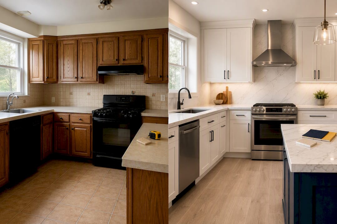
For trades where the work is less visual, HVAC, electrical, plumbing, a short project narrative does the job instead: “Replaced a failing 15-year-old furnace in a Pickering home during a January cold snap, same-day install.” That kind of specific, slightly gritty detail reads as more credible than a polished testimonial ever could, because it sounds like something that actually happened.
SEO best practices specific to contractor landing pages
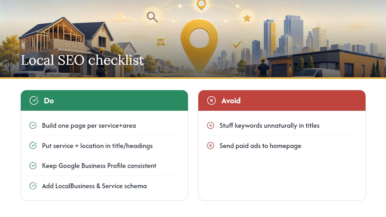
A contractor landing page needs to rank for two things at once: the service and the specific city or neighbourhood, because “plumber near me” searches are almost entirely local intent. That means building separate pages per service and per major service area rather than trying to cram five services and ten cities onto one generic page.
Title tags and headings should include the service and location together in a way that reads naturally, “Emergency Roof Repair in Vaughan,” not a keyword-stuffed string. Google Business Profile signals feed directly into local landing page performance, so keeping your profile updated with the same service areas, categories, and photos that appear on your landing page reinforces relevance on both fronts, a connection covered in more depth in guidance on owning your service area in local search.
Schema markup for LocalBusiness and Service types helps search engines understand exactly what you offer and where, which can influence whether your page earns a rich result or map pack placement. Internal linking between service pages (plumbing links to drain cleaning, drain cleaning links back to general plumbing) helps both users and search engines understand your full service scope without diluting any single page’s focus.
One mistake shows up constantly: contractors send paid Google Ads traffic to their homepage instead of a page built for that specific service and city, which wastes ad spend on visitors who land somewhere that doesn’t match what they clicked on.
Compliance and legal disclaimers contractors shouldn’t skip
Any licence number displayed on your landing page needs to be current and accurate, since misrepresenting licensing status is a legal liability, not just a trust issue. If your trade requires provincial or municipal licensing, display the actual number rather than a vague “licensed and insured” claim with nothing to back it up.
Warranty language needs to match what you can actually honour in writing. A “10-year workmanship warranty” mentioned on a landing page should mirror the exact terms in your contract, not an aspirational number someone in marketing thought sounded good. Financing offers, if you display estimated monthly payments or promotional rates, typically require a disclosure noting that terms are subject to credit approval and that the displayed figures are estimates, not guaranteed rates.
Privacy compliance matters too. Any form collecting a name, phone number, or address should link to a privacy policy explaining how that information gets used and stored, particularly if you’re passing lead data to a CRM or a third-party follow-up service. This isn’t optional legal decoration, it’s a baseline expectation for any business collecting contact information online, and skipping it can create real exposure if a lead’s information is mishandled.
What the checklist gets right and where most advice still falls short
Most contractor marketing advice treats the landing page like a brochure: describe your services, list your years in business, add a contact form, done. That approach ignores the actual behaviour of someone searching for “emergency roof repair” at 9 PM, which is urgency, not research. The checklist above works because it’s built around that urgency, not around what makes a business owner feel proud of their website.
The most overrated piece of advice we see repeated everywhere is “add more content to rank better.” A contractor page loaded with paragraphs about company history and mission statements pushes the CTA further down the page and slows load time, both of which hurt conversion directly.
If you take one thing from this checklist, prioritize message match and mobile speed before anything else. A gorgeous page that loads slowly on a phone, or a fast page whose headline doesn’t match the ad that brought the visitor there, both leak leads before the visitor even reaches your proof section or your form.
— OnLead
How OnLead builds and optimizes contractor landing pages
Onlead is the alternative to a traditional agency for contractor landing pages in Ontario: faster turnaround, direct access to the person actually building your page, and campaigns tied to real tracking from day one instead of a vague monthly report. Onlead’s web design service for contractors builds pages around the exact checklist covered above, message-matched hero copy, sticky mobile CTAs, real trust signals, and speed targets baked in before launch, typically with a working draft ready within 72 hours of your initial audit.
Once the page is live, Google Ads management and Local Services Ads setup can drive traffic to it with tracking numbers and UTMs already configured, so you know from week one which campaigns produce booked jobs, not just clicks. You work directly with founder Vitalii on strategy and copy decisions, not a rotating account manager. Book a free audit and see what your current page is missing, or browse recent contractor landing page work to see the checklist applied in practice.
Sources
- Landing page conversion rate benchmarks (2026) | COREPPC
- Essential contractor landing page tips for 2026 | PipelineOn
- Contractor landing page checklist that captures leads | ProTradeHQ
FAQ
How much should I pay for a landing page?
Costs vary widely depending on scope, but a landing page built specifically for one service and location, with tracking, trust signals, and mobile optimization included, typically costs more than a generic template but pays back through higher conversion rates. Ask any provider, including Onlead, for a custom quote after a free audit rather than relying on a flat industry number.
Can ChatGPT build a landing page?
ChatGPT can help draft headline copy, FAQ answers, or review-response text, but it can’t handle the technical build, mobile speed optimization, tracking setup, or design layout that actually determine whether a page converts. Treat it as a copywriting assistant, not a page builder.
Is there a free app for contractors to build a landing page?
Free WordPress themes like Construction Landing Page include basic building blocks such as contact forms and CTA sections, but they typically require manual work to hit mobile speed targets and correct CTA implementation. A free theme is a starting point, not a finished, conversion-ready page.
What is a landing page for a company?
A landing page is a standalone web page built around one specific offer or service, designed so that everyone who lands on it, usually from an ad or search result, sees a message that matches exactly what they clicked on. Unlike a homepage, it has no navigation menu pulling attention away from the single call to action.
What’s the difference between a contractor’s homepage and a landing page?
A homepage introduces your whole business and links to multiple pages, while a landing page focuses on one service, one area, and one action. Sending paid traffic to a homepage instead of a matched landing page is one of the most common reasons contractor ad campaigns underperform.